
Wrap fields in a grid container
Add `display: grid; gap: 16px; grid-template-columns: repeat(auto-fit, minmax(280px, 1fr));` on the form or a wrapping div.
Form template · Detailed contact form
A contact form laid out in two columns on desktop and one column on mobile. Pure CSS Grid, responsive without media queries, no framework or library required.
Every template is free and fully editable in the drag-drop builder — swap fields, colors, and the button label before you publish.
No server, API route, or SDK — your Multi-Column Contact Form posts straight to one endpoint.
Every submission is emailed to you and saved to a searchable dashboard — spam filtered before it reaches you.
It's plain HTML you own — paste the Multi-Column Contact Form snippet, swap in your access key, and ship.
Copy and ship
HTML by default — the same field set also renders as React, Next.js, PHP, and cURL in your dashboard. Every variant posts to the same /api/submit endpoint. Replace YOUR_ACCESS_KEY with the key from your dashboard; that's the only edit.
<form action="https://splitforms.com/api/submit" method="POST">
  <input type="hidden" name="access_key" value="YOUR_ACCESS_KEY">
  <input type="hidden" name="subject" value="New detailed contact submission">

  <label for="name">Full name *</label>
  <input id="name" type="text" name="name" placeholder="Jane Builder" required>
  <label for="email">Work email *</label>
  <input id="email" type="email" name="email" placeholder="jane@company.com" required>
  <label for="phone">Phone *</label>
  <input id="phone" type="tel" name="phone" placeholder="+1 415 555 0142" required>
  <label for="company">Company</label>
  <input id="company" type="text" name="company" placeholder="Acme Inc">
  <label for="reason">What's this about? *</label>
  <select id="reason" name="reason" required>
    <option value="">Choose…</option>
    <option>Sales / pricing</option>
    <option>Partnerships</option>
    <option>Press / media</option>
    <option>Support</option>
    <option>Careers</option>
    <option>Other</option>
  </select>
  <label for="message">Message *</label>
  <textarea id="message" name="message" placeholder="Give us context — links, dates, deal size, anything we should know." required></textarea>

  <!-- honeypot — bots fill every field -->
  <input type="checkbox" name="botcheck" style="display:none" tabindex="-1" autocomplete="off">

  <button type="submit">Send</button>
</form><p class="splitforms-attribution" style="margin-top:12px;font-size:11px;color:#888;text-align:right">
  Powered by <a href="https://splitforms.com" style="color:#888;text-decoration:none" target="_blank" rel="sponsored noopener">splitforms</a>
</p>
How to add it
To add a Multi-Column Contact Form to your site you need three things: a free splitforms access key, the HTML snippet above, and your key pasted into it. No backend, database, or CAPTCHA library — the form posts to one URL and every submission lands in your inbox and dashboard.
Add `display: grid; gap: 16px; grid-template-columns: repeat(auto-fit, minmax(280px, 1fr));` on the form or a wrapping div.
Subject, message, and submit button get `grid-column: 1 / -1` so they span both columns regardless of viewport.
First/last name share a row. City/state/zip share a row. Use semantic <label> + <input> pairs so the grid layout doesn't break accessibility.
What's included
Long contact forms feel less daunting in two columns. The CSS-only trick is `grid-template-columns: repeat(auto-fit, minmax(280px, 1fr))` — fields automatically reflow to one column on narrow viewports without media queries. Group related fields (first name / last name, city / state) into the same row and full-width fields (message, subject) span both columns with `grid-column: 1 / -1`. Two columns on desktop, one column on mobile, zero media queries.

Where submissions go
Reply-to is wired to the visitor's email, so one tap on Reply answers them directly — while the built-in honeypot and spam classifier filter out bots before they reach you. Every submission is emailed to your inbox and can forward to a webhook or Slack the moment a visitor hits send.

How SplitForms works
Connect your form, collect every submission, and send data where it needs to go — without building backend infrastructure.

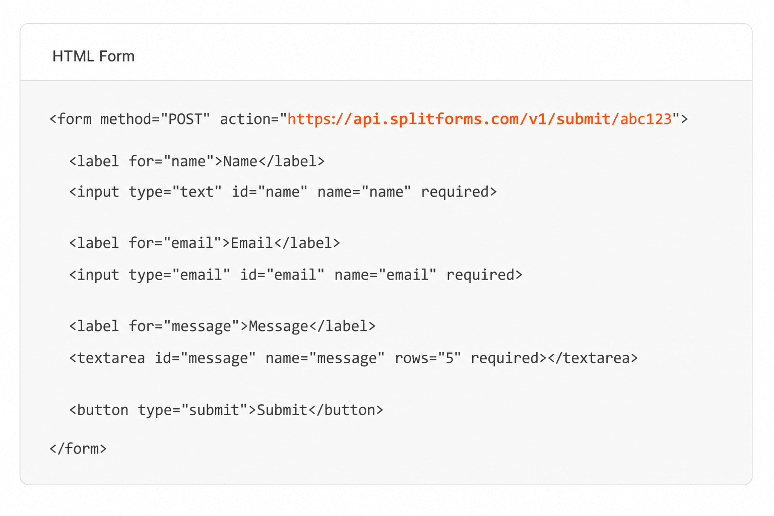
Point your form to your unique SplitForms endpoint. That's it.
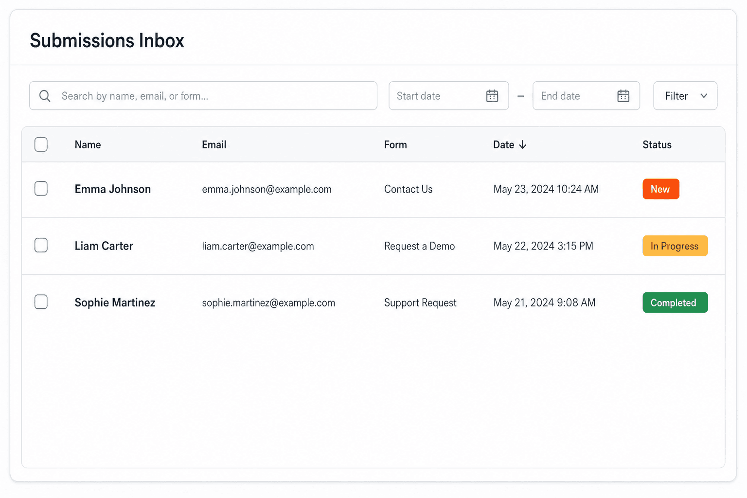
We instantly capture and organize every submission in your inbox.
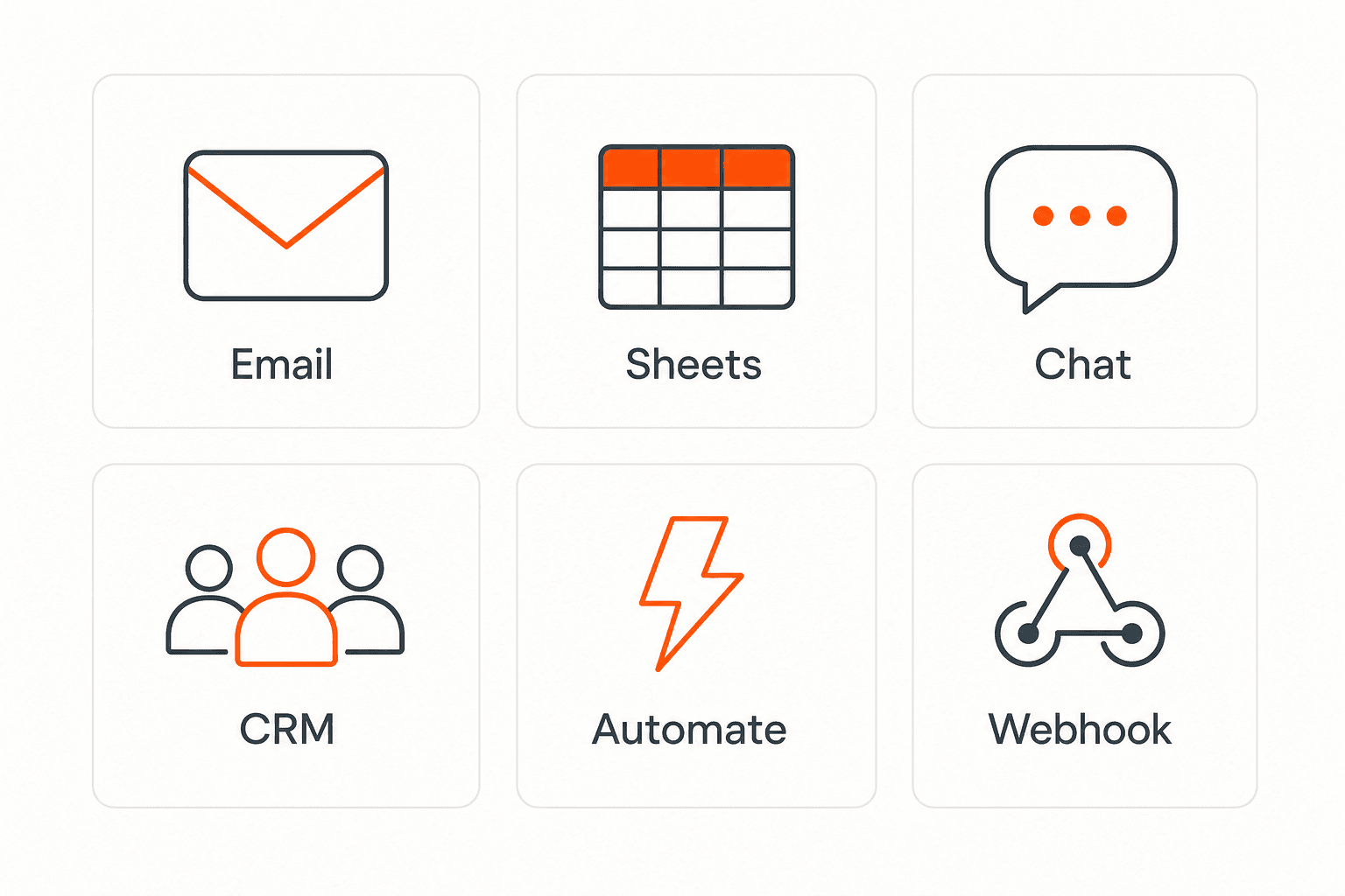
Send data to email, spreadsheets, CRMs, webhooks, and 7,000+ apps.
No credit card required. Set up in under 60 seconds.
Connect & automate
SplitForms works with the destinations you route to and the platforms you build on — from Slack and Sheets to WordPress, Shopify, and Next.js.

Trusted by indie teams and agencies shipping forms worldwide
Testimonials
40 quotes on record — from indie hacks to agency migrations.
“I replaced a Lambda + DynamoDB + SES contact form with six lines of HTML. It took eleven minutes, and the dashboard is better than what I was going to build.”
“We migrated 14 client sites off Formspree in a single weekend. The price is a third of what we paid, the API is more honest, and the spam filter actually works.”
“The webhook payload is signed, idempotent, and well-shaped. It reads like code from a competent team, not a CRUD app held together with duct tape.”
“I stopped reaching for Typeform on small marketing sites. splitforms covers 90% of the use case at none of the bloat.”
“I onboarded our whole agency in an afternoon. The MCP integration meant Cursor literally dropped the form straight into our client repos for us.”
“The free plan gave me 500 submissions before I paid a cent, and Starter is a dollar a month. I've spent more on coffee deciding which backend to use.”
“Spam went from forty junk entries a day to zero, with no reCAPTCHA puzzle ruining the form. The honeypot and time-trap just quietly do their job.”
“Point the form action at one endpoint and you're done. No SDK, no client library, no build step. This is how a form backend should feel.”
“Leads land in Slack the second someone submits, and a copy goes to Google Sheets for the sales team. I wired both up in under ten minutes.”
“I run a static Hugo site on a five-dollar VPS. splitforms gave it a real contact form without me standing up a single server.”
Questions
auto-fit collapses columns when the minimum width can't fit — so a 2-column desktop layout becomes 1-column at any viewport narrower than ~600px without writing a single media query. Cleaner and more resilient than explicit breakpoints.
Wrap it (or its label) in an element with `grid-column: 1 / -1`. That spans from the first track to the last regardless of how many tracks the grid currently has.
No — IE11 has partial CSS Grid support that doesn't include auto-fit. If you must support IE11, fall back to flex-wrap with explicit width: 50% on field wrappers. Otherwise auto-fit is the right call.
Yes. With CSS disabled, all fields stack vertically — the HTML order matches the visual order in a 2-column layout, so it degrades cleanly.
Simple pricing
Choose a plan that fits your workflow — from a free form endpoint to full automations, exports, and higher submission limits.
Free forever
For side projects and indie devs.
For builders who want every paid feature for $1/month.
For agencies and growing products.
Pay $59. 3 years sorted.
No credit card required on Free • Cancel anytime


